SOHA • 2019
While still working in Brazil, I had the pleasure to collaborate with SOHA, a startup that combines software and hardware to apply IoT (Internet of Things) in transportation facilities, agriculture, security, and monitoring products.

ROLE & MAIN ACTIVITIES
As a LEAD PRODUCT DESIGNER, I was responsible for performing UX Design Consulting, as a contractor in one of my last companies in Brazil. So, I conducted the UX and UI activities with the support from the clients, and the users involved. We've also had a very short time to work, aiming to meet the deadlines of an important partnership conquered by SOHA.
THE EXISTENT PRODUCT & GOAL
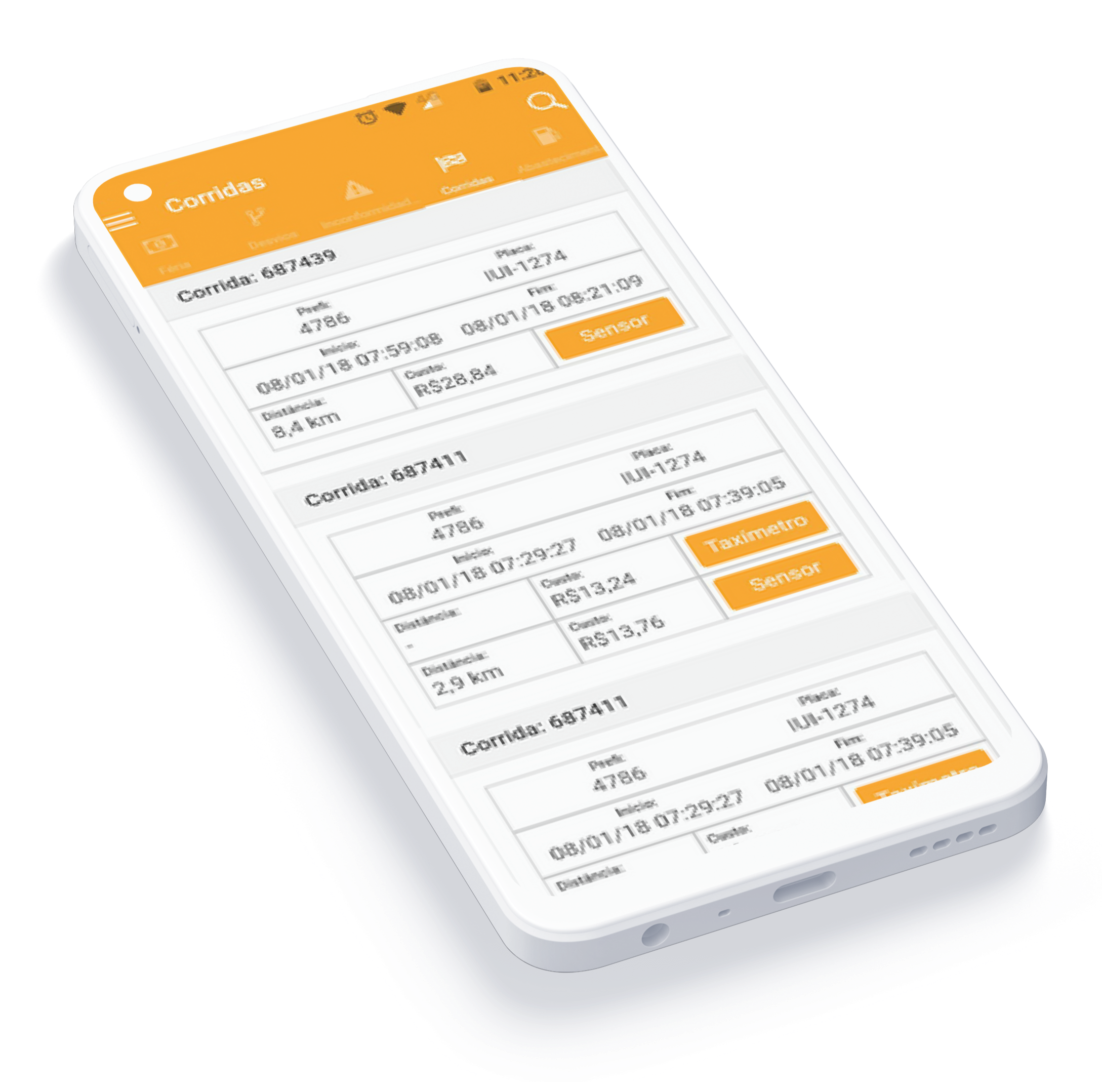
SOHA had an Android-based MVP named Féria, designed and developed by them. However, after some iterations with selected users, they noticed several problems involving usability, accessibility, and aesthetics.
Then, the main goal was to transform what had already been determined as business rules and operational limitations, while optimizing journeys and improving the look and feel.
For context, Féria is an application for taxi owners or fleet managers who wants to have effective control of how much money they are making. For this, it is necessary to install hardware (sensors) in the car parts that will monitor a series of activities such as routes, car occupation, taximeter, and fuel supplies, among other things.

Figuring Out
The first step of the process, and even though we already had an MVP version, was to understand how the application sets out to work, what are the "Jobs to be done" and the already known users’ expectations.
Problem framing and definition
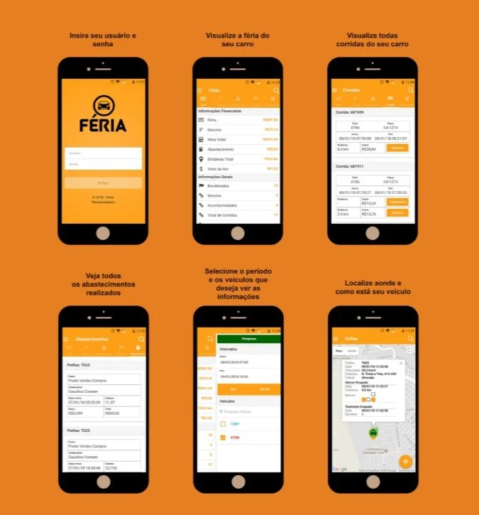
Some of the problems reported by users were related to information architecture and the difficulty of visualizing and interpreting the presented data.
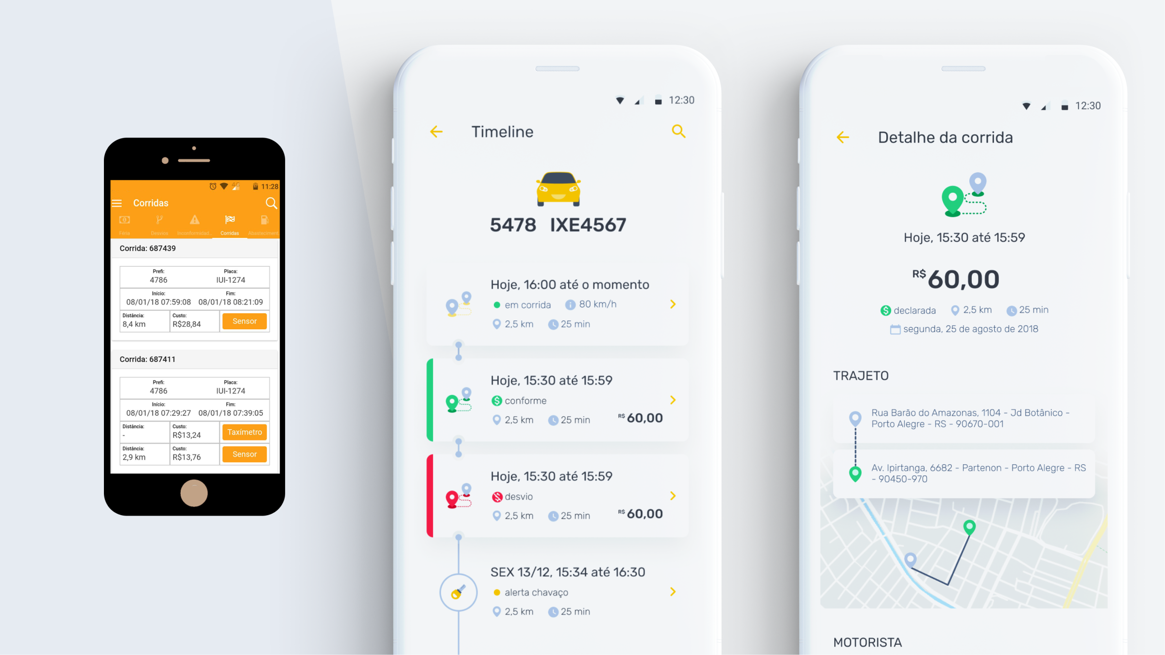
As we can see in the images, the information was captured by the sensors in the car and was shown raw on the screen, without any treatment or systemic interpretation.
HEURISTICS ANALYSIS
To improve users’ perceptions, it was also necessary to perform a heuristic analysis of the actual system. By doing this, we hoped the findings could guide us to the priority issues, so here are our results:
Problems in the visibility of system status, everything has the same color and hierarchy;
Some icons and labels didn't match the real world (language was not adapted to the user's semantics);
The instructions are not so clear, so the user didn't know what to do next;
Although some Material Design standards were being followed, we mapped some contrast issues and odd behaviors;
The system has a lack of feedback and micro-interactions;
Unnecessary use of cognitive load, since the information was not automatically calculated;
Lack of aesthetics and good practices of visual design.
Flows and Journey Mapping
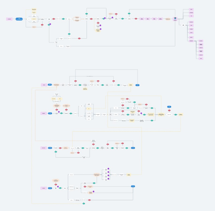
With a big-picture of the most known problems, I could start to work on the user flows. We had a lot of sub-flows and interconnections between features and processes that would be realized in and out of the app, so, I start to map all these happy and sad paths of interactions:
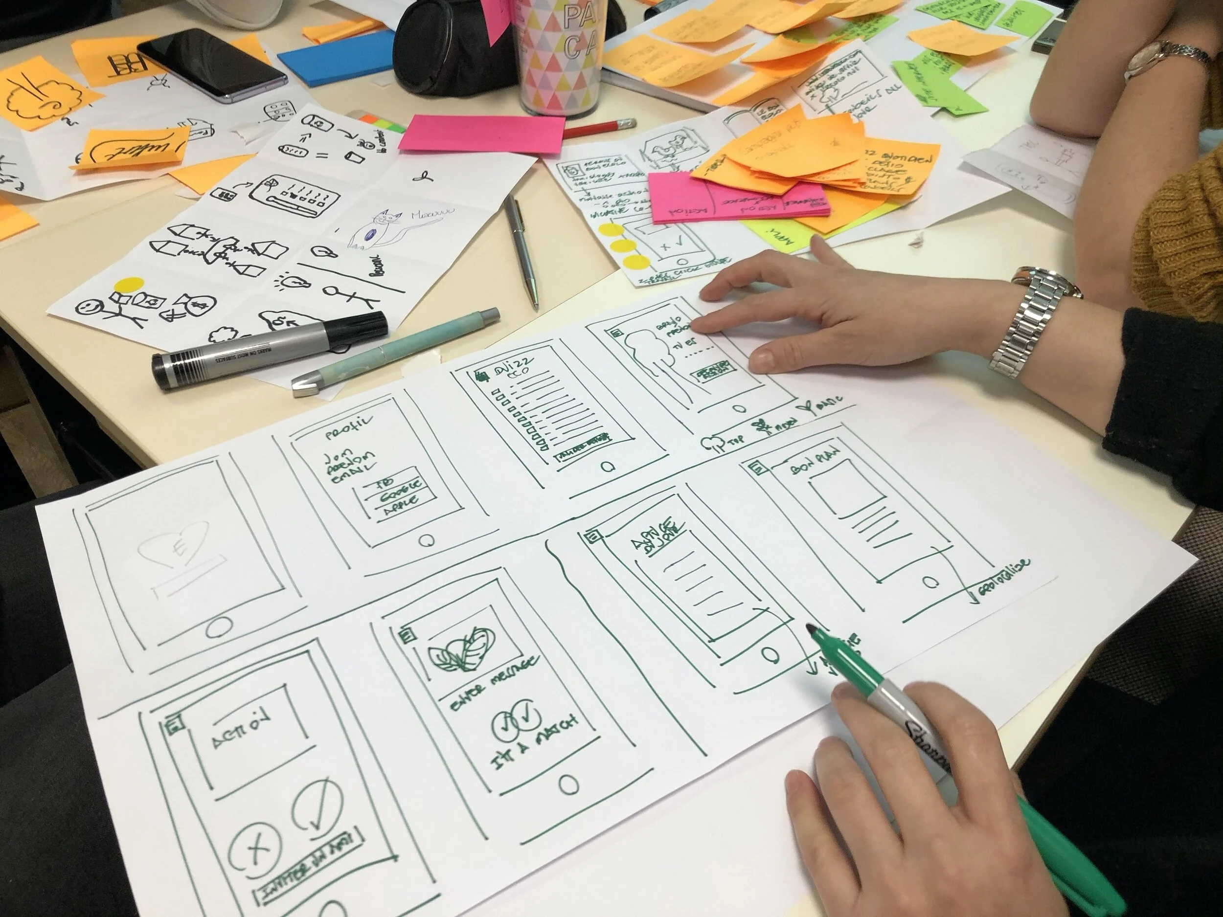
Iterations with users
Journeys were revalidated several times by the client and me, with users' feedback. In this process, we discovered a lot of opportunities to simplify some paths.
Finally, after some cycles, we've had a definition and the time to start playing with colors, typography, illustrations, and micro-interactions has come.
UI DESIGN PROCESS
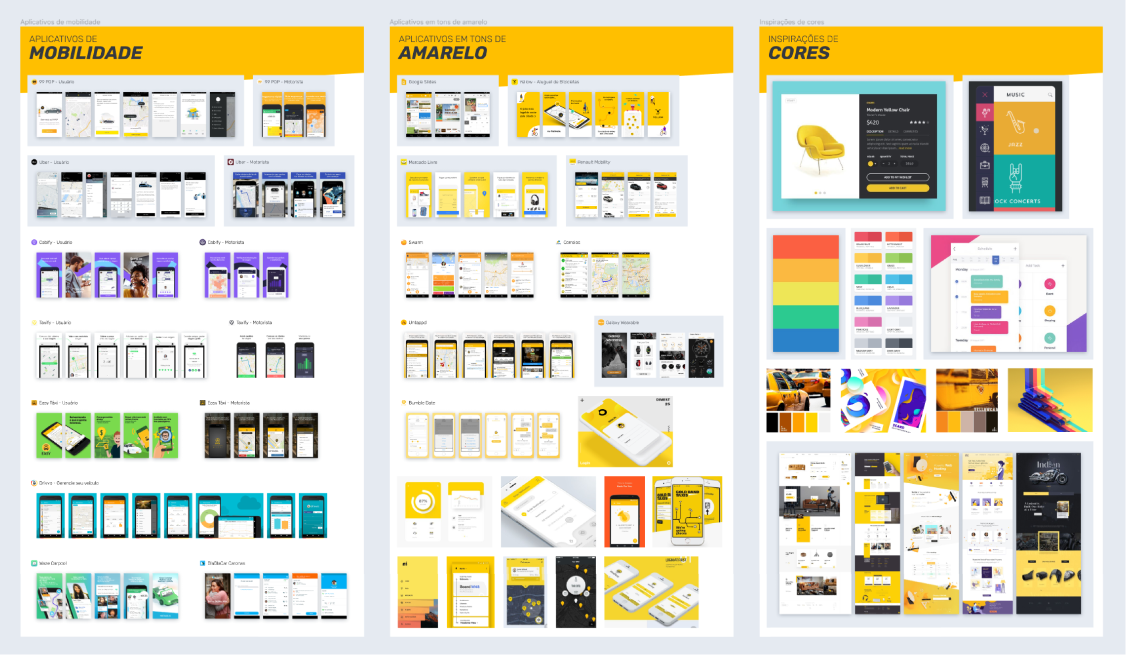
The founders of SOHA would like to preserve the Yellow/Orange approach in the app concept, so I made some studies of other mobility apps, other yellowish apps, and some harmonic combinations.
Colors & Typography
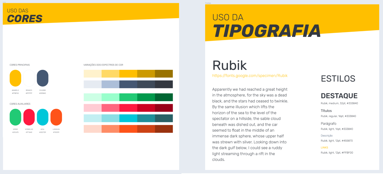
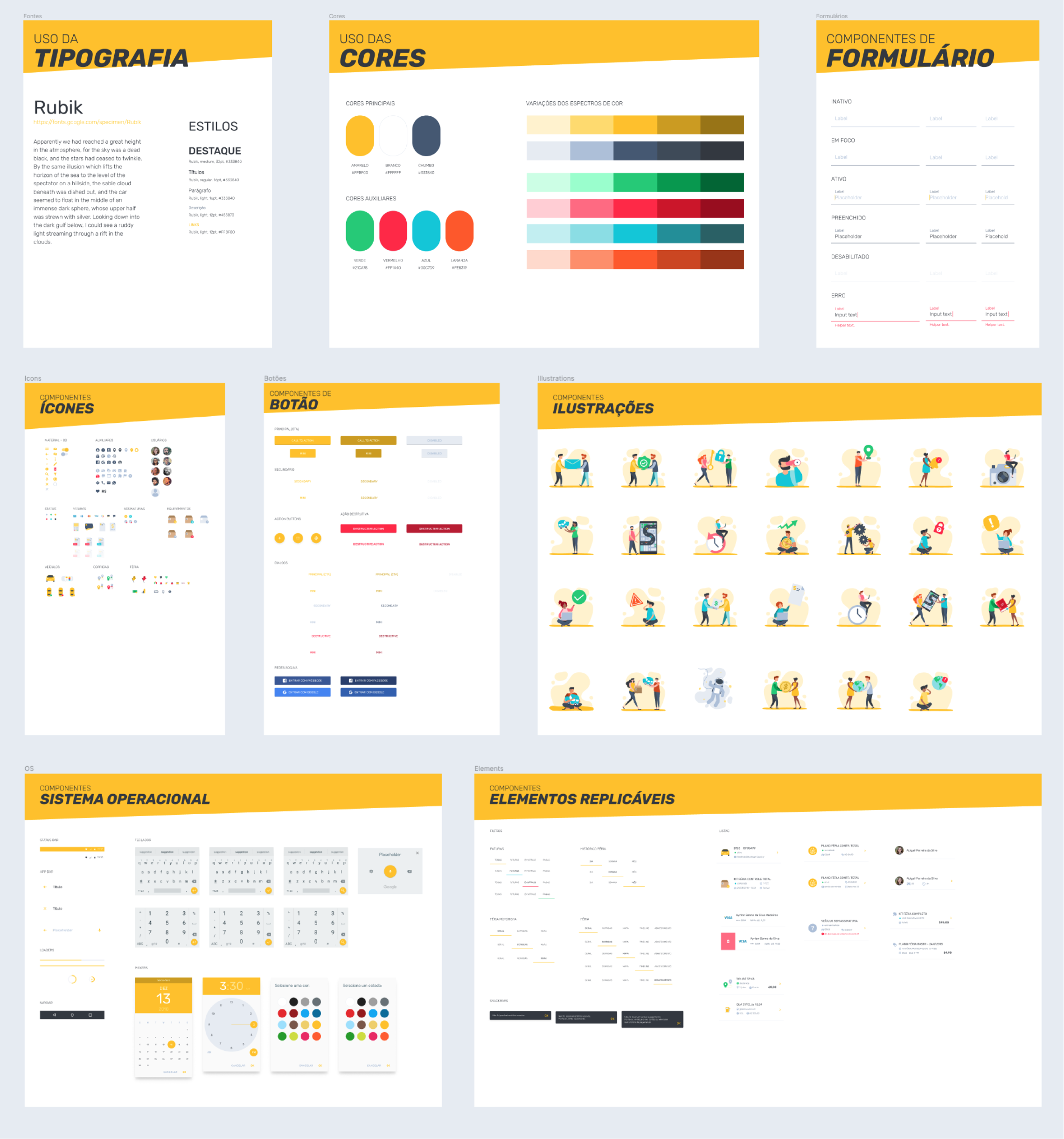
Yellow is an energetic and vibrant color, so when we achieve the perfect shade (not so clear to harm contrast and not so dark to avoid a "dirty" look) it was easy to define complementary and other harmonic colors to use in the system:
To bring some personality to the solution, I suggested Rubik instead of Roboto's standard Android typography. This specimen also has different weights, so we can work with a good visual hierarchy too.
Brand adjustments
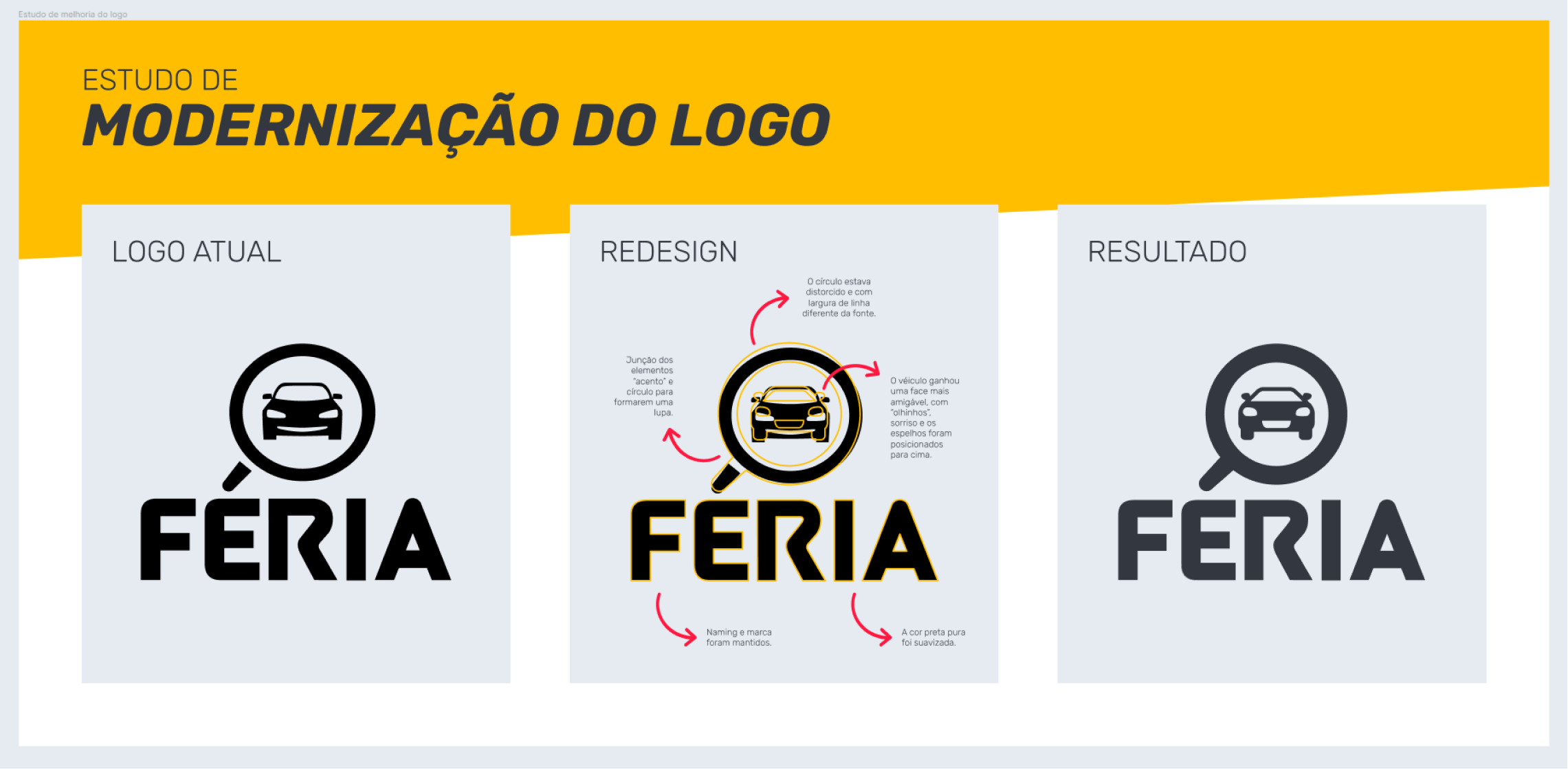
I was also invited to suggest some brand adjustments, as the Féria logo had some form and spacing issues. So I kept the naming and lettering but changed the pictogram:
Combined the accent and the circle, getting a magnifying glass;
Adjusted the elliptic form to a perfect circle;
Put a "happy face" in the vehicle, with up eyes and ears to stimulate a joyful impression through pareidolia;
Rounded the sharpened angles and adjust lines thickness;
Softened the pure black color.
App Assets
Modifications in shape and color were applied in the App Icon, too, as light and dark modes:

Design System
Visual consistency and optimization of resources are the keys to good use of Design Systems. After setting colors, typography, and illustration direction (filled or outlined icons, simple or complex pictograms, colorful or monochromatic, images or vectors, etc.) we have a range of possibilities. In this case, the application was native Android, so, you can see a lot of Material Design inspiration.
THE BIG CHANGES
Given the magnitude of the product (more than a hundred screens and behaviors), it would be unfeasible to show all interactions, so I will use the comparative method to demonstrate some of the most significant changes:
Easy access through Social Media Auth
In the first version of the app, the user should contact SOHA to request a user and password, which are sent by e-mail to each user. To accommodate old and new users, we offer the option to access the application with existing credentials, and the new ones have been induced to use Social Media authentication.

Online and Offline processes are fully integrated
When accessing Feria for the first time, the user is oriented to find a business partner from whom they can buy and install the hardware in the vehicle. After installation, the integration of hardware and software is made by QR code scanning, followed by vehicle identification.

New Information Architecture and a proactive approach
Users don't need to search for vehicles to see all the data related to them, now we can show your entire fleet activity, in real-time. Besides that, the drawer menu was designed to emphasize the three main features and easily provide important pieces of information.

Sensor's info is now organized and interpreted
Information was interpreted and organized to improve readability, fast identification, and understanding of the data captured by the sensor's hardware. Now, users can get global stats and information combined with specific and categorized ones.

Improvements in visual communication
Cards and color status help the user to understand what is right and wrong with their routes:
Similar info grouped by context
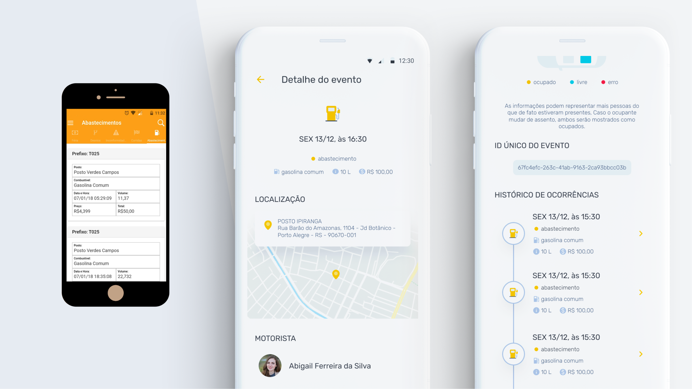
With all the data centralized in a vehicle-oriented timeline, you can see the specific event by time stamp and, beyond that, all the similar events in a historical view. In this case, all the events identified as fuel supply are related to the contextual vehicle:
Structured inputs
Each sensor has both specific and important information about the vehicle, the route, or the money involved in the operation, so I organized them by categories and importance for the driver:

User control and personalization
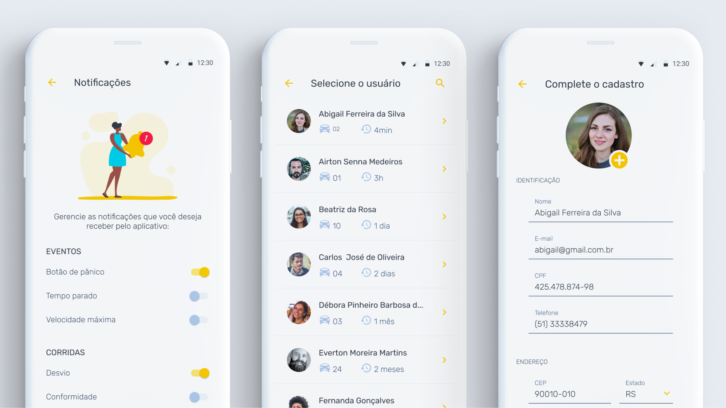
From left to right: Users can control which notifications they would like to receive; fleet managers with admin permissions can have a ’view as’ access to monitor and help their drivers; register is facilitated by Social Media but in case of edit information, the forms are accessible and clear.

“We arrived at the proposal for a sensational app, which could surprise the customer and take our project to another level, in addition to transforming it into a digital technology”
— FELIPE FOLIATTI, SOHA Co-Founder