AES BRASIL • 2015
We built a Press News Feed Platform for AES Brasil, which operates in the Brazilian electricity sector offering generation, commercialization, and distribution of energy for people and companies. By the time of the project, it served 7.97 million customers in 142 cities in South and Southeast regions with a workforce of 8 thousand employees.
ROLE & MAIN ACTIVITIES
We were a small team of 4 warriors: a Project Manager, a Web Developer, a UI Designer, and me as an EXPERIENCE DESIGNER. Because of a budget limitation, we couldn’t run any user interviews before the ideation process. Also, we were working in a Digital Agency that was not practicing any Agile Methodology, so, collaboration was not so clear for all the members of the team and even less for the client.

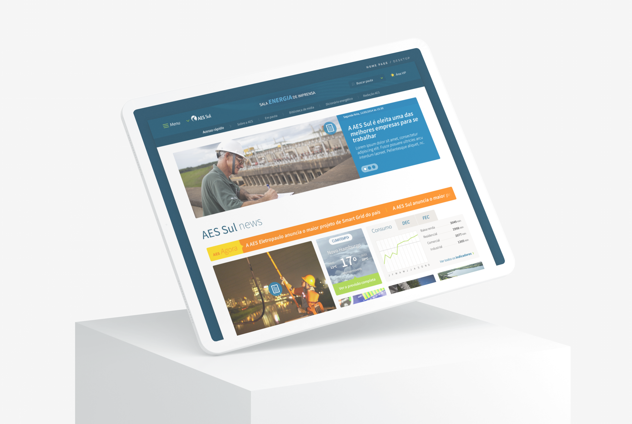
The goal for Sala Energia de Imprensa platform was to become the official press news feed of all AES Brasil operations. The sponsor's ambition was to centralize all its communication fronts in just one place on the internet, where the national press — the target public, could easily find the latest news about energy issues in the country.
THE DESIGN PROCESS
With a bound of methodology resources, the Project Manager and I used the kickoff meeting with the customers to capture as much information as possible about the different users of the new platform and their main purpose.
With all the insights that we could catch, I crossed the data with a large investigative benchmarking research and started to organize all the information that is necessary to ideate some interface possibilities.
At this stage, I used Axure RP, to design sitemaps, flows, and a navigable prototype of the possible solution (our beloved Figma would be launched just in the next year).
We used these artifacts to validate ideas with the client and ran a process of iteration that has last a couple of weeks.
After that, we were ready to refine and think about the visual language of the platform. So, I sit next to the User Interface Designer and we worked together to define some paths to follow like colors, typography, grids, cards, and icons.
Even the tiniest detail would help to communicate some essential functionalities already detailed in the low-fidelity prototype.
So, in a few weeks, the "Sala Energia de Imprensa" was coming to life…
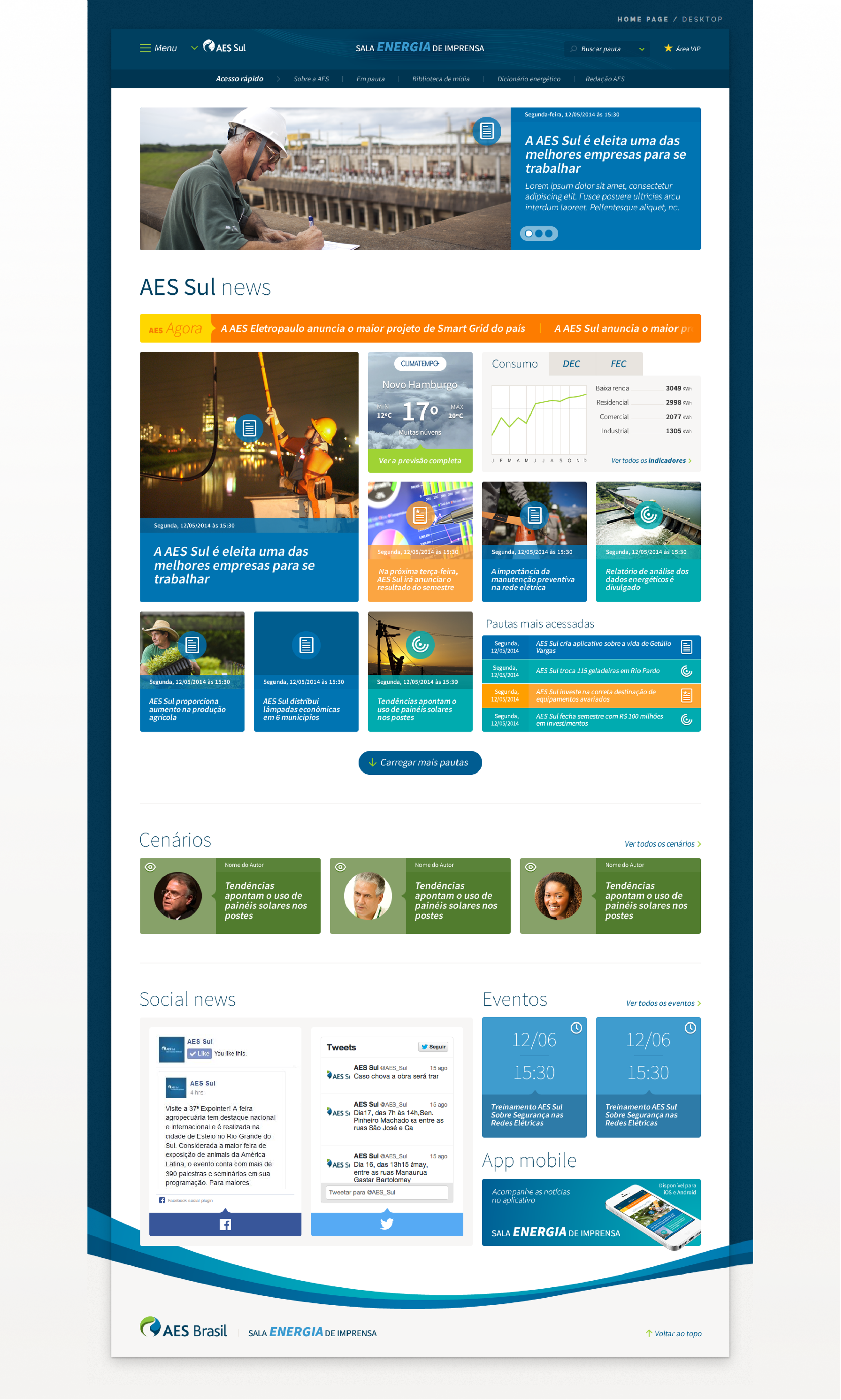
PROPOSED SOLUTION
Colors
The palette was designed to mix all colors from the AES Brasil Brand Guide. Although the vast range of colors, the focus was to pop up the primary ones, while secondaries differentiate areas of the portal.

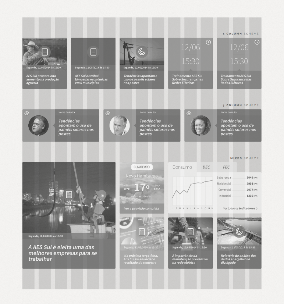
Grid System
A 15-column grid with a 20px gutter was built to fit in the only 1280px desktop version required (we do discuss a responsive version, but the sponsor decided to develop an exclusive app version later). This construction provides diverse card composition possibilities, with up 5 columns of content.
Typography
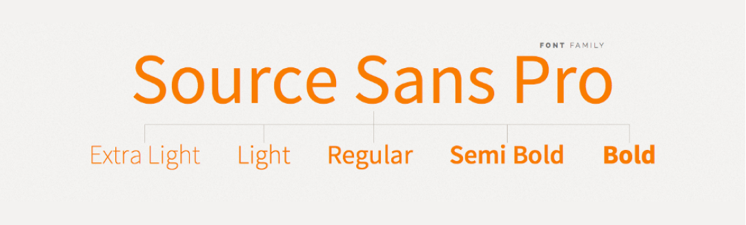
Only the ‘Source Sans Pro’ free Google Font was used in the project. Almost all its variations were applied over the interface. This specific family was chosen due to the visual similarity with ‘Bliss’, which was the official brand font.
Cards
The cards are the principal visual appeal of this portal, we use them to differentiate distinct areas of a subject by colors, icons, and composition types. They are fixed-sized to maintain a good alignment and are spread all over the interface as 'call to actions' for relevant content.
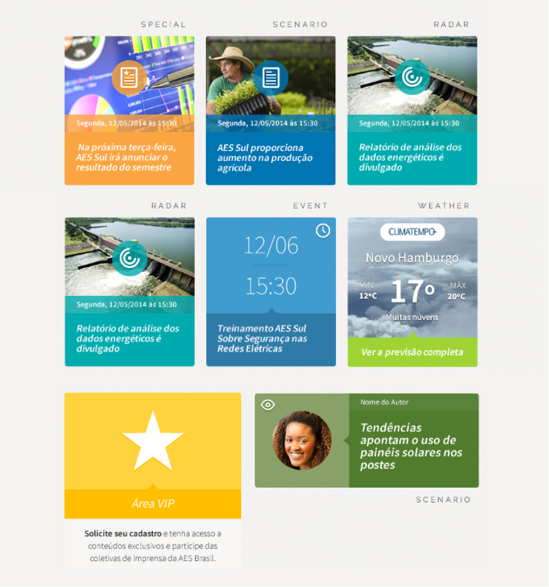
Advanced Search
Due to the amount of content and several news categories, an advanced search engine was created to improve the "looking for articles" experience. The user can search into selected subcategories, periods, and/or keywords. In addition, the color and icon schemes are also applied here to maintain visual consistency.

Style Guide
In order to provide accurate visual consistency all over the project screens, a simple style guide was created with the Basic Design Rules — well, in early 2015 we had not been introduced to Zeplin yet, or Design Systems as well, so we tried to find a way to make the life of our developers easy. Anyway, this document was very useful for the Web Developer on our team because he could fastly identify the specs for fonts, colors, rollovers, forms, and more.
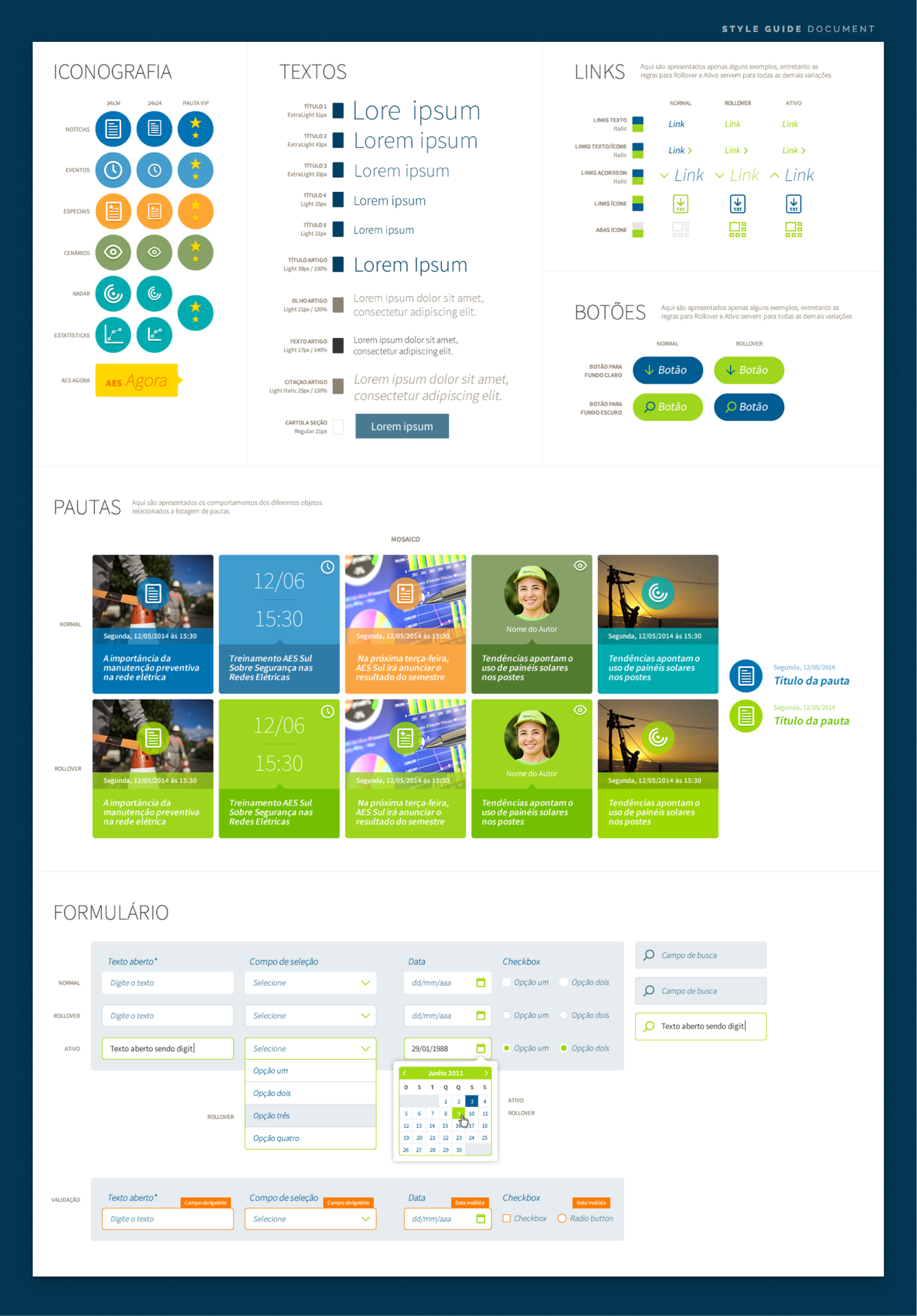
Applied Consistency
With all Basic Design Rules defined, it was possible to materialize interfaces for all the flows in the platform, here you can see some of them:
